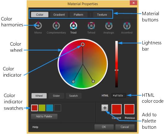
Choosing colors in the Material Properties dialog box
When you edit images in Corel PaintShop Pro, you often need to choose a color before painting, drawing, or filling, making manual color corrections, or choosing a background for a new raster image. The Color page in the Material Properties dialog box is the most versatile tool for choosing colors, especially if you’re building a custom color palette. The color harmonies help you choose colors that look great together.
The Color page appears when you click the Foreground/Stroke Properties box, the Background/Fill Properties box, or one of the two smaller Color boxes. It also appears when you click a Color box found in other dialog boxes.
The Color page in the Material Properties dialog box
The appearance of the Color page depends on the color depth of the active image (16 bits/channel, 8 bits/channel, 256 colors, 16 colors, or 2 colors). For example, for paletted colors, the Wheel, Slider, and Color Harmonies options are not available—swatches display.
The Color page offers many ways to select colors:
• Wheel — clicking the Wheel button displays the Color (hue) wheel and the Lightness bar.
• Slider — clicking the slider button displays a color space drop list and the corresponding sliders and value boxes. You can select RGB, HSL, CMYK, Lab, Web safe, Grayscale.
• Swatch — clicking the Swatch button displays a palette of color swatches. The Standard Palette displays by default, but you can choose any custom palettes from the drop-list.
• Color Harmonies — clicking one of the following color harmony settings helps you choose multiple colors that look good together: Complementary, Triad, Tetrad, Analogic, Accented. The Mono setting is the default for a single color.
The associated color swatches appear in the lower left corner of the Color page. Click a swatch and click Add to Palette to add one or more color swatches to a custom palette.
• HTML color code lets you enter HTML color values.
For more information about color and how it is perceived, displayed, and printed, see
Understanding color and color models.
To choose a color in the Material Properties dialog box
Edit workspace
1 On the Materials palette, do one of the following:
• To choose a foreground color, click the Foreground and Stroke Properties box or the Foreground Color box.
• To choose a background color, click the Background and Fill Properties box or the Background Color box.
The Material Properties dialog box appears.
Click the Color button to display the Color page.
2 Do one of the following:
• Click Wheel, and click a color on the color wheel to select the approximate color. Drag the color indicator from the center of the circle to the outer edge to adjust the saturation. Darken or lighten the color by dragging the slider on the Lightness bar that appears to the right of the color wheel.
• Click Slider, and choose a color space from the drop-list. Adjust the corresponding sliders or type values in the boxes to set the color you want.
• Click Swatch, choose a palette from the drop-list, and click a color swatch.
• In the HTML box, enter a hex color value.
The current and previous color swatches appear in the lower right corner of the dialog box.
3 Click OK.
You can also | |
Choose more than one color by using color harmonies. | Click one of the following color harmony buttons: Complementary, Triad, Tetrad, Analogic, Accented. The associated color swatches appear in the lower left corner of the Color page. Drag the color indicator in the color wheel to adjust the colors. Click a swatch and click Add to Palette to add one or more color swatches to a custom palette. |
You can also choose a color directly on the Materials palette.
To use the current colors with all tools, mark the All tools check box on the Materials palette. If you unmark this check box, the current materials are used by the active tool only.